
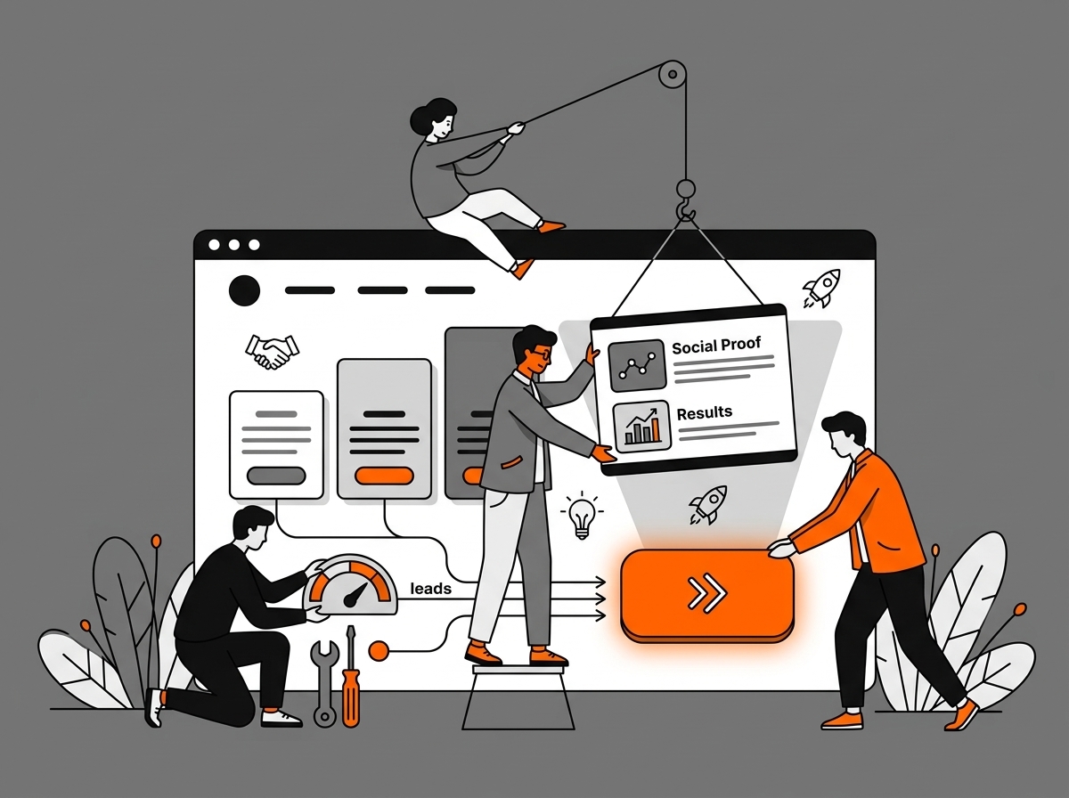
A good website guides the visitor from learning about the offer to making contact. Specific information, organized navigation, and visible buttons help with this. So, it’s worth checking if your website’s layout makes it easier for a client to take the next step.
What the client is looking for
A person who lands on your website wants to quickly determine if you offer what they need, how much it costs, and how they can contact you. If they have to search for this information for a long time, they might just close the page. That’s why every element of the website should have a specific purpose and help answer a potential client’s questions.
Shorten the path to contact
A common problem is contact hidden behind many steps. The menu has ten items, the form is located on one of the deeper subpages, and the brief has to be filled out in an external tool that requires creating an account. Each subsequent step can prompt someone to give up. Check how this looks on your website. Open it exactly as a person looking for your service for the first time would, and count the clicks needed to send an inquiry. If there are more than two or three, the process can probably be simplified.
Consistency builds trust
When every subpage has a different layout for headings, spacing, and buttons, using the website becomes tiring. The user has to learn it all over again every time. Even if they don’t notice it consciously, such chaos doesn’t help build trust in the company. It’s worth sticking to one system: use the same fonts, accent colors, heading layouts, and button styles. Thanks to this, the website is easier to browse, and the company looks more organized.
What these changes bring
When a website clearly describes the offer, facilitates contact, and maintains a consistent look, clients less often ask for information they can find on their own. They also reach the form or contact details more easily. A sales conversation can therefore go more smoothly, because the potential client already knows what to expect before contacting you. The visual setting can be subdued. What’s important is that after a few seconds, the user understands what the company does and what they can do next.